

City Service Portal
Project Overview: Developed ePALS™, an online software system for permitting and licensing, designed for local governments.
Client: City of Norwalk, California
Timeline: July - August 2025
Role: UX Designer
Team: 1 Product manager, 3 Soft engineers, 1 Graphic designer, 1 Product designer
Business Permit Portal
Context

The City of Norwalk sought to redesign its business permit portal,
an online system that lets officers manage, track, and update permits with detailed information.

The Problem
🤷 “Font size is too small, and everything is too complex."

- Norwalk City Officer
Some of the images have been edited or covered to comply with the NDA.The Original screen has a problem with overall usability.
User Research

Interviews with four Norwalk City officers revealed pain points such as complex workflows, which informed design decisions.

Design Process - Ideation


The discussion focused on where to place the filter, considering content adjustments and guided by users' goals and logical reasoning.
Filter placed on the left
👍Pros
·Aligns with users’ natural left-to-right scanning.
·Accessible without interfering with content.
·Familiar placement in many interfaces.
👎Cons
·May be skipped when scanning primary actions.
·Can create a left-heavy layout.

Filter placed above the list
👍Pros
·Highly visible and easy to access.
·Intuitive placement for filtering results.
👎Cons
·Uses vertical space, pushing content down.
·Extensive filters may clutter the interface.

Filter placed on the right
👍Pros
·Keeps focus on content or results.
·Less intrusive for users prioritizing results.
·Accessible without disrupting content.
👎Cons
·Less intuitive as users expect filters on the left.
·Filters on the right may be overlooked.

Filter overlaps in the list
👍Pros
·Compact design, saving screen space.
·Improves content focus by appearing as needed.
·Ideal for space-constrained interfaces.
👎Cons
·Can block content, affecting user experience.
·Reopening filters for comparisons may be tedious.
·May confuse users on how to access or dismiss it.
Left placements are more stable for persistent filters and when users need constant access to filter options.
Right Ideal for keeping the focus on results, allowing users to adjust filters after reviewing content.
Above the List is ideal for immediate discoverability but should be carefully designed to avoid taking too much vertical space.
Overlapping the List offers a clean, space-saving option but could cause frustration if it obscures key information.
Overall Considerations

Iteration
The initial filter designs were proposed in a way that maintained consistency with the existing website structure while prioritizing readability and usability.
An expandable filter design was created to avoid endless scrolling, but it was put on hold due to the issue of increased number of clicks.
To address the issue of an increasing number of clicks, a solution was proposed to display selected options as filter chips after selection. However, displaying too many options as chips could increase the user's workload, presenting a potential usability concern.
Following a stakeholder meeting, the design was adjusted to retain only the most essential visible filters, while the remaining options were placed under 'Filter.' Clear grouping was implemented to enhance user understanding of the options.
Validation

Usability testing was conducted with 8 participants using both the original screen and the redesigned demo, yielding significant results.

Solution

Micro Interactions

The prioritized filter options are positioned above the main filter section and display the number of selected options when applied by users.

All date-related categories are consolidated under 'Date,' allowing users to view and access all date options in one place.
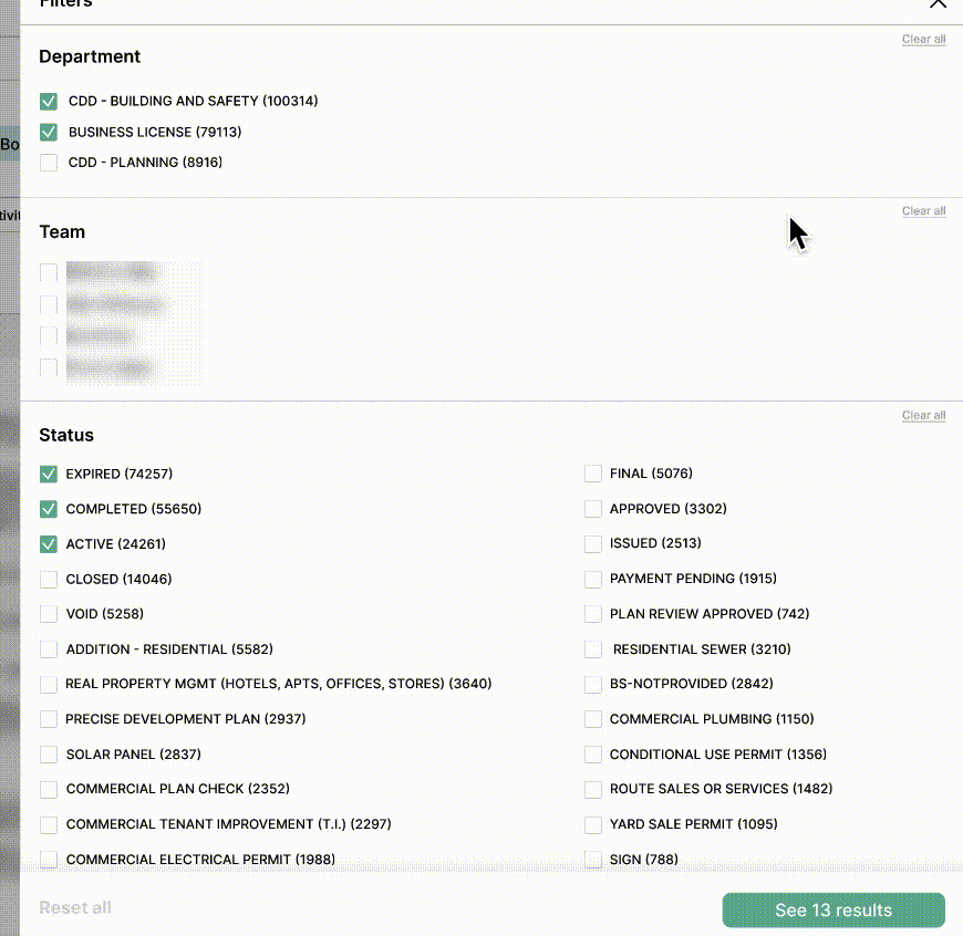
All categories are grouped under All Filters. Multi-select options use checkboxes, single-select options use radio buttons, and the Amount filter allows manual numeric input instead of sliders due to its wide range.
Final Design
The final screen applies Saira’s updated branding, replacing the city logo, updating colors, and integrating a new design system. Increased white space was used to create a cleaner, less overwhelming UI.
Outcomes
🙋♀️ “This update saves me so much time compared to the old version."
- 43, female, Norwalk City Officer
🙆♂️ “I wish we’d had this version from the start. It’s so much better!"
- 52, male, Norwalk City Officer

Takeaways
Consider the real-world context users are in when making design decisions, as an option that seems perfect in theory may not work well in practice.
Explore various design alternatives and iterate to ensure the product works well for users in different scenarios.
Bridge the perspectives of users, stakeholders, and the company to create a balanced and effective solution.