Safeway Case Study
and Design Iteration
Timeline: Sep 2024- Nov 2024
Team: 1 Product manager, 2 UX Researchers, 1 Product Designer
Role: Product Designer (UX research & Design)
Tool: Figma, Lucid, Google survey, In-person interview
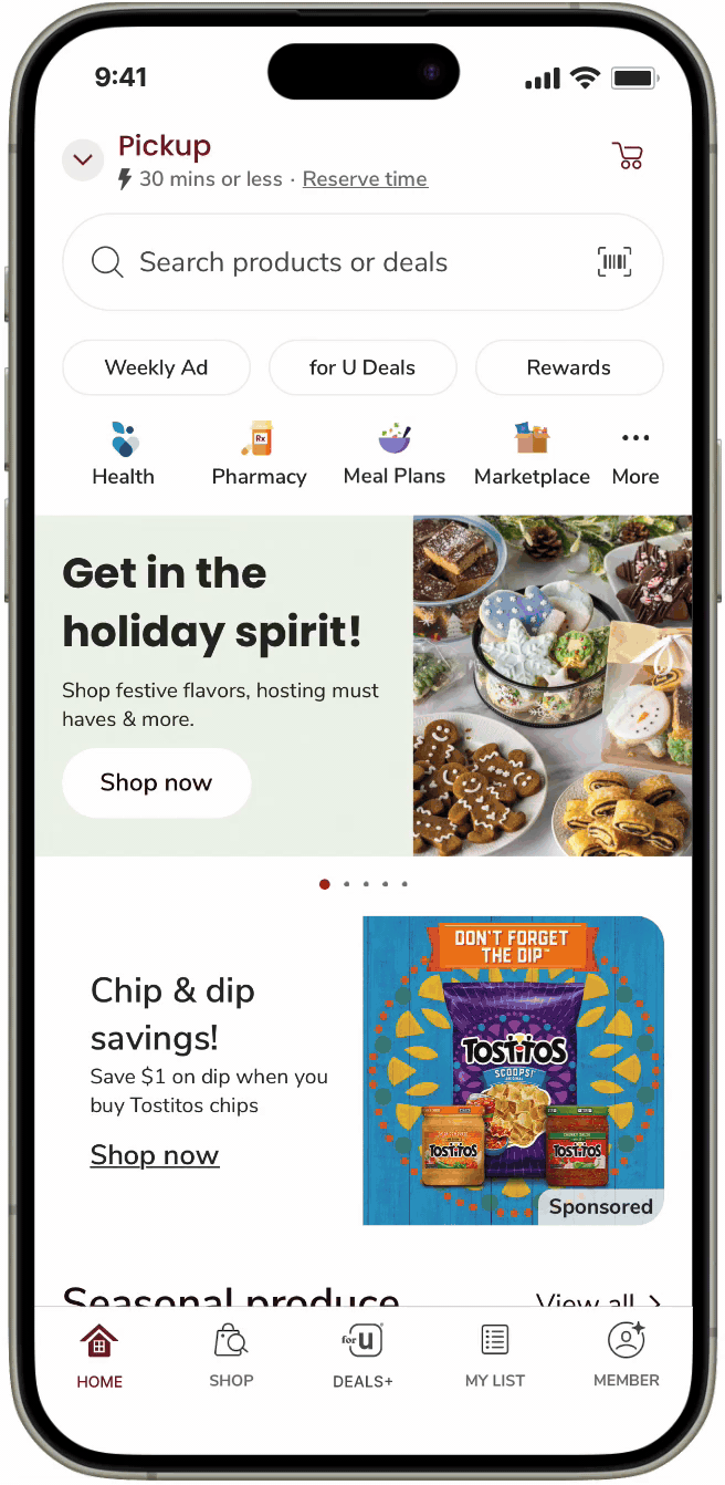
Say Goodbye to User Confusion
Summary
I streamlined Safeway’s cart and coupon flows to improve clarity and interaction through two design iterations.


Lack of clarity and missing features
Problem
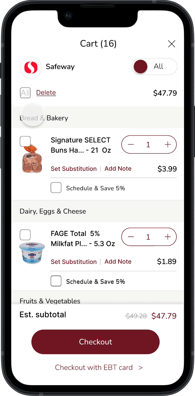
Task flow 1: Deleting Items

😱 Problem: Hard to find delete; no bulk option.
🛠️ Fix: Made delete visible; added 'clear all'.
Task flow 2: Applying Coupons

😱 Problem: Users confused post-apply.
🛠️ Fix: Pinned applied coupons with labels.
Find where people are suffering from
User Research
Research Goals
Gain a better understanding of the needs of the user
Observe where users get stuck or frustrated
Find areas of the app that could be improv
Methodology
Task-based: Provide 4 tasks
Time recording during the tasks
Post-test surveys
Questionnaires
Participants
Participants are novice users of a grocery store shopping app.
4 participants are college students from the ages 20-25
4 participants are adults ranging from the ages 47-56


Key Usability Metrics
For our Usability Metrics, we focused on 4 separate measures.
- Time spent on task
- Success on task
- Number of clicks
- User satisfaction
Pain Points

“Hmm, where's the delete?”
— Female, 20 years old

“Where did the coupon go? I thought I just applied it.”
— Male, 40 years old
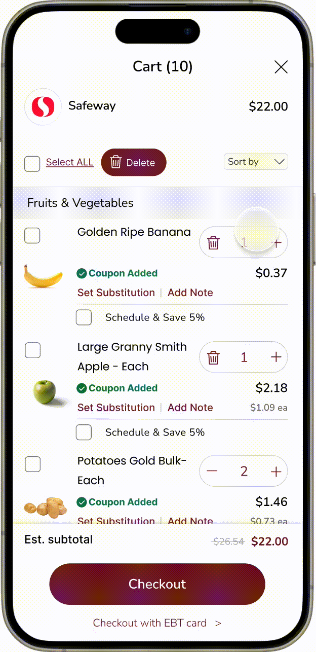
Cart Experience
Users were unable to delete meal plans all at once.
Also, the ‘Meal Plan’ feature was not integrated fully into the cart experience.

Coupon Experience
Coupons were not applied to the subtotal automatically. Users had to take extra steps for them to be applied.
Product Goal

Complete with confidence
Reducing confusion and improving overall satisfaction.
Design Ideation
Challenge 1. Shopping Cart Experience -Deleting
Delete button
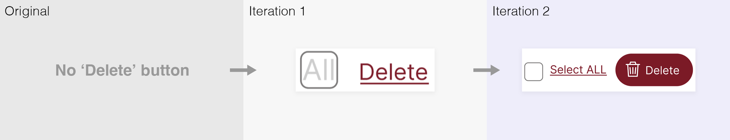
Users hesitated to use the 'All' checkbox, leading to a clearer redesign in Iteration 2.
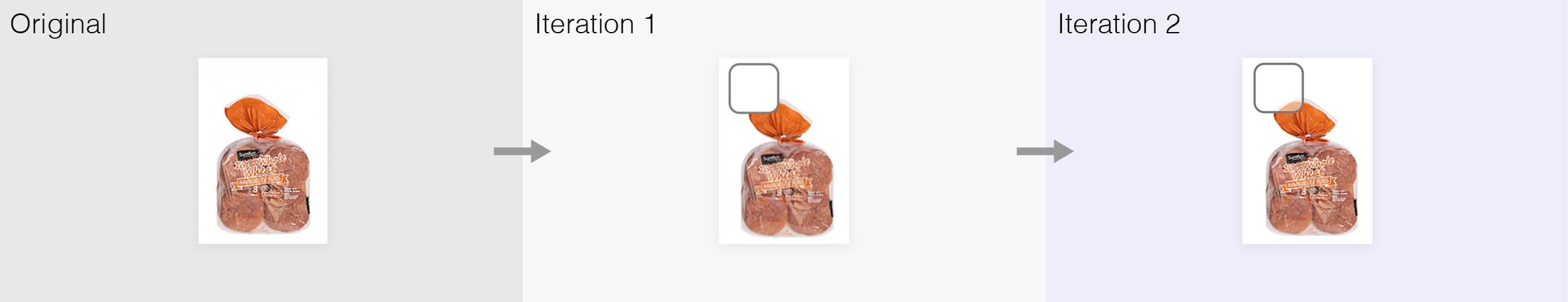
Amount button

Updated quantity controls (+/–), then replaced with trash icon for single items and clarified outline.
Challenge 2. Shopping Cart Experience - Select

Meal plan sorting button

I replaced top-right toggle with a clearer dropdown near price, based on user feedback.
Meal plan category in the item list

Refined background style and added icon to clarify 'Meal Plan' category.
Checkboxes for items
Refined checkboxes with transparency to enhance item visibility.
Challenge 3. Coupon Deals Experience
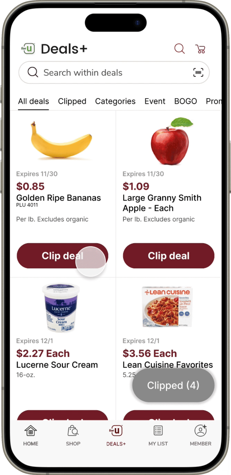
Meal plan sorting button

Repositioned ‘Clipped’ tab and enhanced red dot for better engagement.
Clip deal button

Made deal cards persist after click with updated CTA and ‘Clipped’ label for clarity.
‘Clipped’ button
Improved ‘Clipped’ button visibility by reversing colors, enlarging size, and bolding text.
Final Design

User Evaluation
Unexpected finding

While task success improved and clicks decreased, the time to add a coupon initially rose. User research revealed that the phrase “Apply the coupon” caused confusion—participants expected “Clip deal” instead.
After correcting the wording, task time dropped from 28.3s to 6.52s.
This highlighted how even small language choices can greatly affect user comprehension and efficiency.


Wording issues caused results to diverge from overall trends.
Key Findings
The devil is in the details
Visual clarity matters: Small layout and icon changes significantly improved usability.
Affordance is critical: Clearer buttons increased discoverability of key actions.
Simplicity speeds tasks: Streamlined UI reduced task completion time.
Language shapes understanding: Familiar terms (e.g., “Clip deal”) improved user comprehension.
Iteration drives improvement: Each test surfaced new issues, and iterative fixes boosted usability.
Collaboration builds stronger design: Feedback and teamwork were essential to growth.
More on design details ↓
ㅤ
More on design details ↓ ㅤ
Challenges in Cart and Coupon Flows
Users faced confusion with meal plan items and coupon tracking.
The challenge was balancing added functionality with a clean, intuitive interface.
Below are the design solutions I implemented.
Challenge 1. Shopping Cart Experience - Deleting
Before
No ‘clear all’ option — users had to delete items one by one.
Quantity adjustment and item removal were unintuitive.
Unclear coupon status led to confusion at checkout.
Final
‘Select All’ checkbox enables quick cart clearing.
Streamlined quantity button simplifies item adjustment.
Clear “Coupon Added” label removes checkout confusion.
Granular Design Decisions for Challenge 1
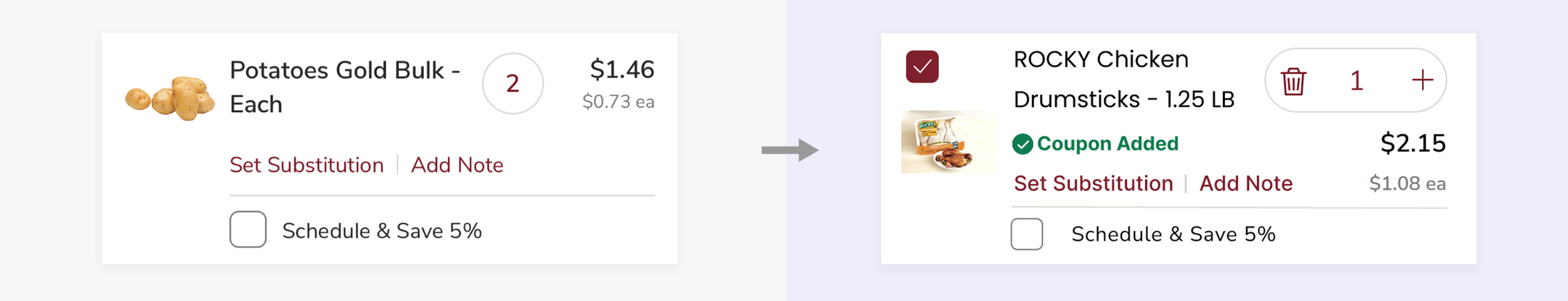
Product Card Usability Improvements
Design Changes:
Added a checkbox (top-left) for more flexible actions.
Moved price below quantity button to reflect real-time updates.
Slightly reduced item name font size (17pt → 16.5pt) to fit coupon alert.
Redesigned quantity button to avoid overlapping with price.
Trade-offs:
👍 Benefit: Users see price updates instantly when adjusting quantity.
👎 Drawback: Slightly more complex layout, but improves clarity in the long run.

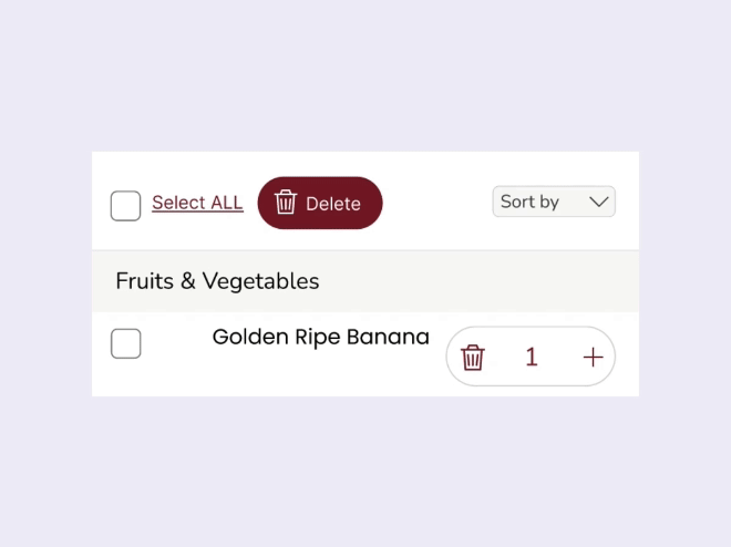
Extending Cart Header for Better Item Management
Design Changes:
Added 'Select All' checkbox and 'Delete' button for quick item removal.
Introduced a gray sorting dropdown to visually separate actions.
Removed underline beneath ‘Cart’ for a cleaner look.
Trade-offs:
👍 Benefit: Enhanced functionality makes item management easier and faster.
👎 Drawback: New controls may require a short adjustment period for users.

Challenge 2. Shopping Cart Experience - Select
Before
It was difficult to delete items from a recipe, and users had to remember which items they added.
Final
A sorting dropdown now separates items into 'Product' and 'Meal Plan,' allowing users to delete all or some items from the recipe based on what they’ve added.
Granular Design Decisions for Challenge 2
Improve Item Discovery
Design Changes:
Introduced a 'Sort by' dropdown with 'Product' and 'Meal Plan' options.
Added a clear label to clarify functionality.
Designed dropdown to blend seamlessly without visual clutter.
Trade-offs:
👍 Benefit: Helps users quickly locate Meal Plan ingredients, saving time and improving cart usability.
👎 Drawback: May feel unnecessary for users not using Meal Plans, adding slight complexity.

Introducing a New Category for Recipe Management
Design Changes:
Added a recipe-specific checkbox for one-step removal of all related items.
Introduced a meal plan icon to clearly distinguish recipe items from regular products.
Trade-offs:
👍 Benefit: Improves clarity and control, making it easier to manage recipe-based items.
👎 Drawback: Users may need time to learn the new icons and sorting behavior.

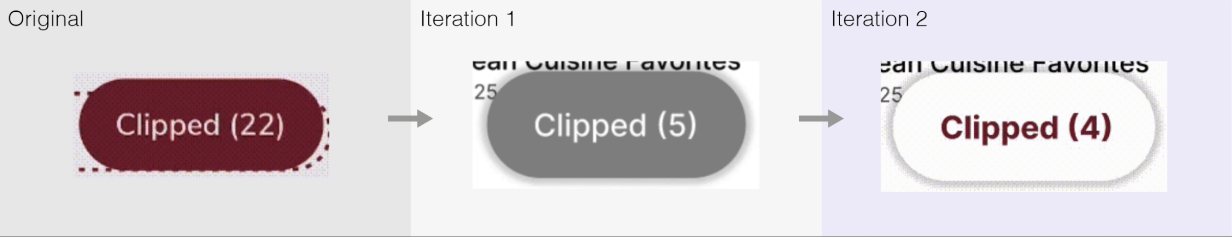
Challenge 3. Coupon Deals Experience
Before
The 'Clipped' category in the top menu didn’t display clipped items and was hard to find, far from the 'All deals' section.
Item cards disappeared after clicking 'Clip deal,' creating confusion about what was clipped.
The 'Clipped' button was hard to spot due to poor placement and design.
Final
A red dot now provides instant feedback when a deal is clipped, improving visibility and awareness.
Instead of disappearing, the item card changes to 'Shop Coupon' after clipping, creating a smoother transition and guiding users to the next step.
The 'Clipped' button was enlarged, and its color contrast was improved for better visibility.
Granular Design Decisions for Challenge 3

Clarifying Status Change in the Same Location
Design Changes:
Replaced paper-style coupon with a button for better affordance.
After clicking, the label changes to ‘Shop Coupon’ and shows a ‘Clipped’ notification.
Kept the card visible to maintain context and guide next steps.
Trade-offs:
👍 Benefit: Reduces confusion by keeping the UI consistent and confirming user actions.
👎 Drawback: May add visual clutter when clipping many deals at once.

Enhancing Button Style for Better Discoverability
Design Changes:
User testing showed the bottom-right ‘Clipped’ button was hard to find.
Increased button size, contrast, and added shadow to improve clickability.
Bolded the font for better readability.
Trade-offs:
👍 Benefit: Boosts visibility and encourages user interaction.
👎 Drawback: May conflict with existing design system using red backgrounds and white text.