Safeway Case Study and Design Iteration
Enhancing limited functionalities and optimizing usability for a more seamless experience.
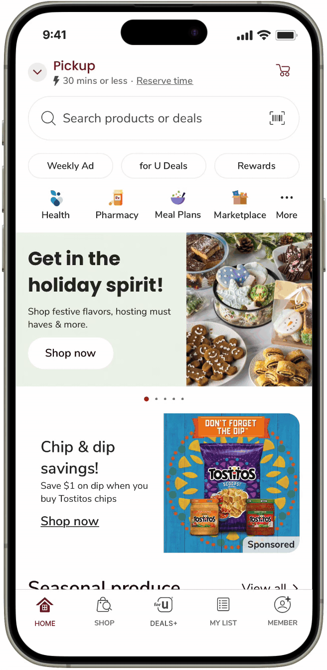
Context Safeway's app ranked highly among food and drink apps in the US, had inconsistencies in user experience. I focused on optimizing the checkout process, particularly in specific use cases involving the cart flow.
Role Product Designer - Led design iteration, conducted UX research, and collaborated with a team of a Product Manager and 2 UX Researchers.
Team 1 Product manager, 2 UX Researchers, 1 Product Designer
Timeline Sep 2023- Nov 2023
Tool Figma, Lucid, Google survey, In-person interview
Constraints User research included 8 participants, a small sample size that may not fully represent the target audience, impacting generalizability.
What did I learn? Balancing differing opinions and synthesizing user insights into a cohesive design. This process fostered deeper reflection and improved my strategic thinking.
Summary
Say Goodbye to User Confusion
In two design iterations, I addressed key points of friction in the cart and coupon processes. The refined design simplifies these areas, creating a smoother, more intuitive experience where users always know the outcomes of their actions.
Final Design
Design Challenges and Solutions in Cart and Coupon Management
Managing the cart and coupon processes brought several challenges. Users struggled with meal plan items and coupon tracking, leading to confusion. The key challenge was improving usability while adding functionality without overwhelming the interface. Below are the solutions I developed to tackle these issues.
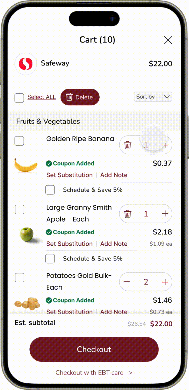
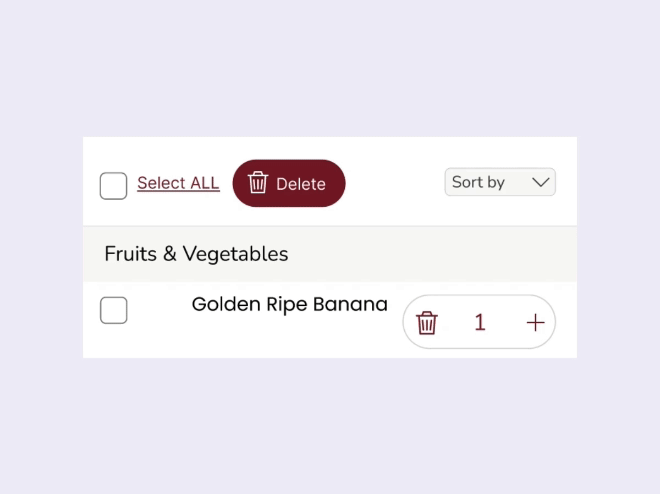
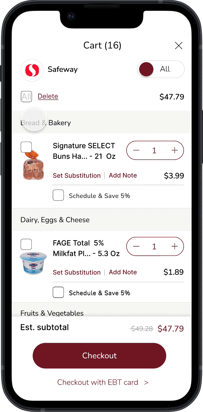
Solution 1. Improved Management of Your Cart
Before
No option to empty the cart at once, forcing users to remove items individually, which was tedious and time consuming.
Adjusting quantities and deleting items felt unintuitive, adding unnecessary steps to the process.
Uncertainty around whether a coupon was applied, causing confusion during checkout.

Final
A "Select All" checkbox enables users to empty the cart with one action, significantly improving efficiency.
The quantity button now allows users to adjust items with a single click, streamlining the task.
A "Coupon Added" indicator clearly notifies users when a coupon has been applied, eliminating checkout uncertainty.
Granular Design Decisions for Solution 1
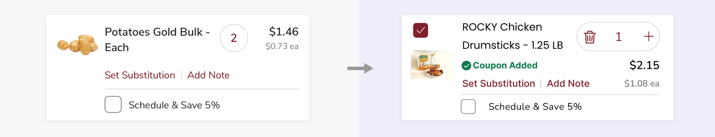
Product Card Usability Improvements
Focus: How might we help users access more information from the item card?
Design Changes:
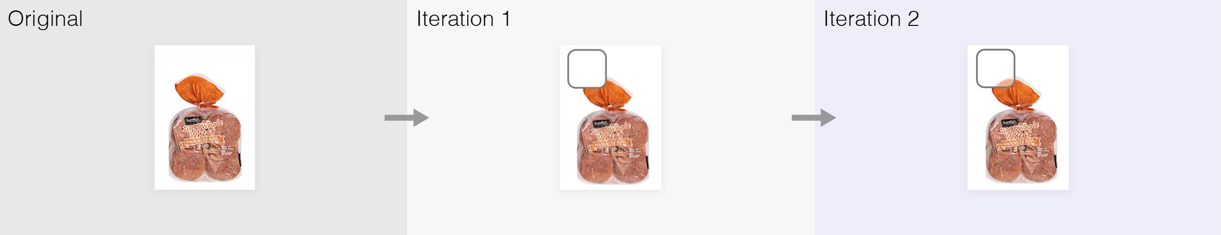
Added a checkbox to the top left to provide users with more flexibility in their actions.
Moved the price below the quantity button to make price changes visible as users adjust quantities.
Reduced the font size of the item name (from 17pt to 16.5pt) to accommodate the coupon notification.
Redesigned the quantity button to prevent overlap with the price display, ensuring clear visibility.
Trade-offs:
👍 Benefit: Users can instantly see price changes when adjusting the quantity, improving the overall experience.
👎 Drawback: While the layout might initially seem more complex, it ultimately provides better clarity for managing prices and quantities.

Extending Cart Header for Improved Item Management
Focus: How might we add new features without causing confusion?
Design Changes:
Added a 'Select All' checkbox and 'Delete' button for quick, one-step item removal.
Introduced a sorting dropdown on the right, with gray color to visually separate functions.
Removed the line under 'Cart' to simplify the design while maintaining clarity.
Trade-offs:
👍 Benefit: Users can now utilize the cart with more functionality, simplifying item management.
👎 Drawback: Users might initially find the extra buttons and sorting features confusing, requiring a slight learning curve.
Solution 2. Improved Tracking of Items from Your Meal Plan

Before
It was difficult to delete items from a recipe, and users had to remember which items they added.
Final
A sorting dropdown now separates items into 'Product' and 'Meal Plan,' allowing users to delete all or some items from the recipe based on what they’ve added.
Granular Design Decisions for Solution 2
Adding sorting feature
Focus: How might we help users easily find items from Meal Plans?
Design Changes:
Added a dropdown for sorting with two options: 'Product' and 'Meal Plan' to help users locate items based on their origin.
Included a clear 'Sort by' label to ensure users understand the feature.
The dropdown design maintains a clean and organized cart without adding visual clutter.
Trade-offs:
👍 Benefit: The sorting feature makes it easier to manage and find items, especially Meal Plan ingredients, improving efficiency and reducing search time.
👎 Drawback: Users who don't use the Meal Plan may find the sorting option unnecessary, adding slight complexity for some.

Showing new category with new function
Focus: How might we reduce confusion when adding a new function?
Design Changes:
Added a recipe-specific checkbox to remove all items from a recipe in one step.
Introduced a meal plan icon to visually distinguish recipe ingredients from regular products, improving cart management and clarity.
Trade-offs:
👍 Benefit: Separating meal plan items gives users more control and simplifies recipe adjustments, saving time.
👎 Drawback: Users may need time to adjust to the new sorting options and icons.
Solution 3. Improved Confirmation of Your Coupons

Before
The 'Clipped' category in the top menu didn’t display clipped items and was hard to find, far from the 'All deals' section.
Item cards disappeared after clicking 'Clip deal,' creating confusion about what was clipped.
The 'Clipped' button was hard to spot due to poor placement and design.
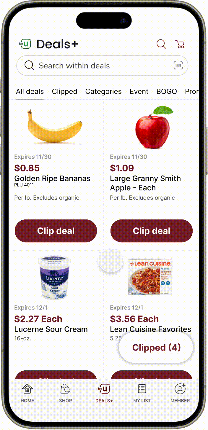
Final
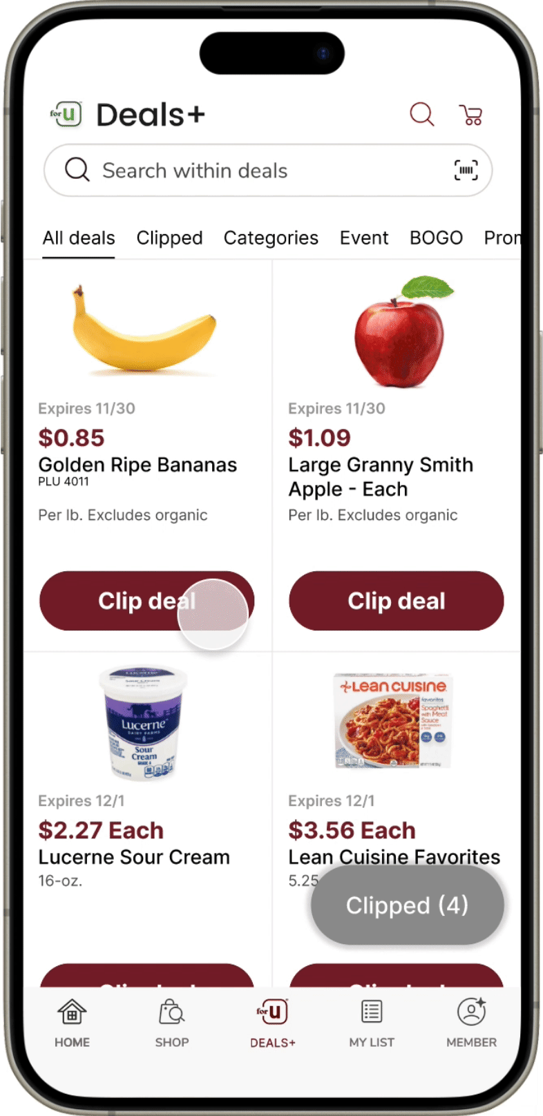
A red dot now provides instant feedback when a deal is clipped, improving visibility and awareness.
Instead of disappearing, the item card changes to 'Shop Coupon' after clipping, creating a smoother transition and guiding users to the next step.
The 'Clipped' button was enlarged, and its color contrast was improved for better visibility.
Granular Design Decisions for Solution 3

Different status at a same location
Focus: How might we make the state change clear and intuitive?
Design Changes:
The paper coupon style resembled traditional flyers but lacked affordance and appeared already clicked.
The button was updated for better affordance and changes to 'Shop Coupon' after being clicked.
The 'Clipped' notification confirms the action and guides users to the next step.
Trade-offs:
👍 Benefit: Keeping the deal card visible and consistent reduces user frustration and confusion.
👎 Drawback: May cause visual clutter for users clipping multiple deals.

Button style changing
Focus: How might we help users to find multiple ways to reach their goal?
Design Changes:
User testing revealed difficulty finding the 'Clipped' button due to its bottom-right location.
Improved readability by increasing the button size, adding stronger contrast, and applying a shadow for a more clickable appearance.
The font was bolded for better visibility.
Trade-offs:
👍 Benefit: Enhanced user visibility and interaction.
👎 Drawback: This design may not align with the app's existing system, which uses red backgrounds with white font.
Problem
Lack of functionality and Hidden affordances
I observed that the main confusion arises when users try to delete items, particularly when the items are added through a feature called ‘Meal Plan’. Another issue is when users apply a coupon, as it doesn’t clearly indicate where the discounted items are located.
Task flow 1: Deleting Items
😱 What made this process difficult?: Users struggled to find the delete button and couldn’t delete items all at once.
🧐 Why?: The delete button was a hidden feature, only accessible by swiping the item card. Additionally, there was no option to empty the cart in one action.
🤓 How did I solved this: I introduced features that clearly indicate how to delete individual items or empty the cart.
🥺 Constraints?: The app’s design leans toward minimalism, which posed challenges when adding visible functionality.

Before
Pros Minimal and simple visual design.
Cons Novice users struggle to find the delete feature. Even familiar users must manually delete each item one by one.
Final
Pros Improved usability, with clearer access to the delete function.
Cons The addition of this feature introduces more visual elements, which may reduce the minimalist appearance.
Task flow 2: Applying Coupons
😱 What made this process difficult?: Although the task flow was simple, users struggled to find where to go for the next step.
🧐 Why?: Once a coupon was applied, there was no notification or clear indication, as the coupon moved to the end of an extensive deals list. This wasn’t an issue with a limited number of items, but with an endless list of coupons, it caused confusion.
🤓 How did I solved this: I adjusted the design so that clicked coupons appear at the top of the list with a distinct status on the card. This allowed me to decrease the number of clicks and task time while maintaining the same task flow, making the process more efficient.
🥺 Constraints?: If too many deals are clicked, users may need a sorting button to manage them more effectively.
Before
Pros the 'All Deals' tab always starts with new coupon deals.
Cons It’s hard to find clipped deals because the 'Clipped' section is not easy to access, and the button to view them is difficult to notice.

Final
Pros The clipped deals are now much easier to notice through multiple access points.
Cons The 'All Deals' tab now starts with clipped coupons, pushing new deals further down the list.
Preliminary User Research
Find where people are suffering from
Research Goals
Gain a better understanding of the needs of the user
Observe where users get stuck or frustrated
Find areas of the app that could be improved
Methodology
Task-based: Provide 4 tasks
Time recording during the tasks
Post-test surveys
Questionnaires
Participants
Participants are novice users of a grocery store shopping app.
4 participants are college students from the ages 20-25
4 participants are adults ranging from the ages 47-56
Usability test result
For our Usability Metrics, we focused on 4 separate measures.
- Time spent on task
- Success on task
- Number of clicks
- User satisfaction
- Not Good 😔
- Okay 😐
- Good 😁

Pain Points
Identified Challenges
From the data collected, we identified multiple areas where users experienced confusion, and in some cases, task failure. Below are a few key pain points we uncovered.

“Hmm, where's the delete?”
— Female, 20 years old

“Where did the coupon go? I thought I just applied it.”
— Male, 40 years old
Emptying the Cart
Users were unable to delete meal plans all at once. They had to remove items one by one.

Clipping
Users were unaware that they could tap on the product for more details.
Applying Coupons to Subtotal
Coupons were not applied to the subtotal automatically. Users had to take extra steps for them to be applied.
Product Goal
Complete tasks with ease and confidence
Reducing confusion and improving overall satisfaction.
Design Ideation
Deleting feature
My initial goal was to minimize visual changes to preserve the app's original concept. However, I soon realized this approach wasn’t effective for achieving the needed usability improvements.
How did they turned out at the end
Delete button
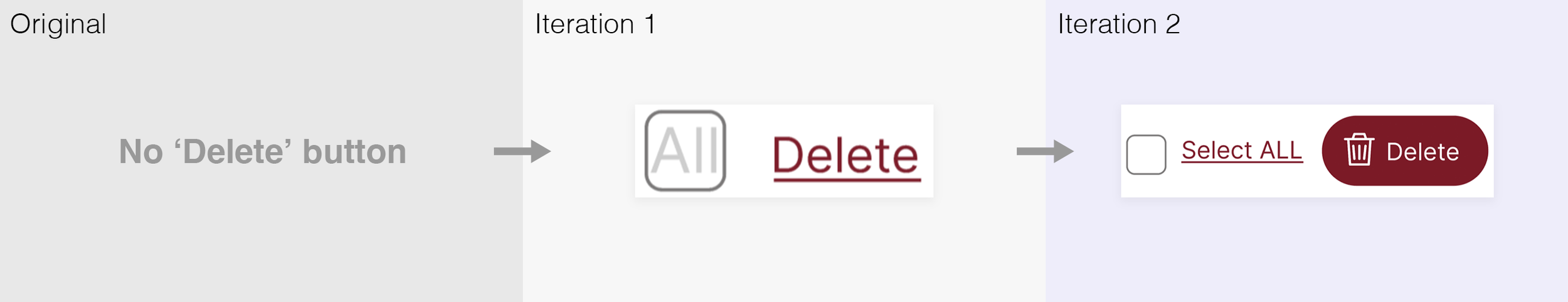
During user testing, participants hesitated to click the 'All' checkbox in Iteration 1 because they were unsure of its function. The design was refined in Iteration 2 for clarity.
Amount button

In Iteration 1, I extended the quantity button to display the decrease and increase options, reflecting how the Original button behaved when clicked. In Iteration 2, the minus icon became a trashcan when the quantity was 1 for clarity, and I lightened the button's stroke to emphasize its content
Switching button

To implement the ‘Meal Plan’ category, I created a toggle to switch between All items and Meal Plan items. After testing different placements, I positioned it near the top right, aligned with the Safeway logo, as I determined it should have higher priority than other features.
How did they turned out at the end
Meal plan sorting button

After the second round of testing, users found the labels ‘All’ and ‘Meals’ confusing, and many didn’t understand the toggle's purpose. In Iteration 2, I replaced it with a dropdown menu to clarify its sorting function and moved it, swapping places with the price amount, since sorting wasn’t the highest priority.
Meal plan category in the item list

In Iteration 1, the ‘Meal Plan’ category had a darker gray background, but it didn’t convey the new category well. In Iteration 2, I matched the background to existing categories and added an icon to clearly distinguish it.
Checkboxes for items
After adding checkboxes in Iteration 1, they were revised in Iteration 2 with transparency to allow for a larger item image.
Applying Coupon
A flexible and efficient system isn’t just about helping users transition from novice to expert use; it’s also about allowing users to approach tasks in multiple ways to suit their working style.
How did they turned out at the end
Meal plan sorting button

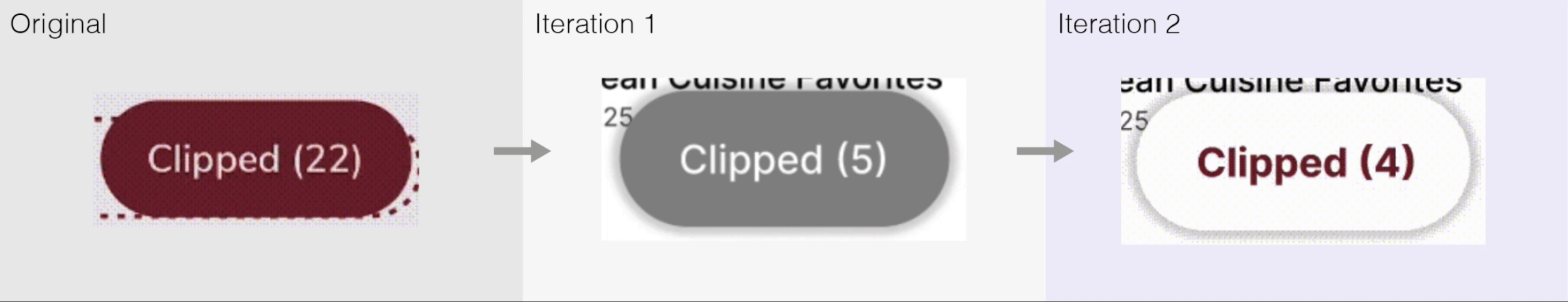
Originally, the 'All deals' and 'Clipped' sections were separate, which made it hard for users to navigate smoothly. I changed the design to put these sections next to each other, which made the flow better and added a red dot to the 'Clipped' section to make it more noticeable. Even with this change, users still found the red dot hard to see during testing. Based on this feedback, I made the red dot bigger in the next version, which really helped make it stand out and got users more involved.
Clip deal button

Initially, clicking on a deal caused the card to vanish, creating confusion. I updated it so the card remains but changes to 'Shop Coupon' after being clicked, leading users to related coupons. A new green "clipped" notification was also added for more precise recognition.
‘Clipped’ button
Participants initially missed the 'Clipped' button due to its placement. I chose not to move it since I had already added a notification above. Instead, I changed the icon's color to make it more visible. Later, realizing the gray clashed with their design system, I reverted to the original style but reversed the text and button colors for better contrast. I also made the button larger and the text bolder for clearer visibility.
User Evaluation
Unexpected finding
What did we miss?
While task ratings improved and clicks decreased, the time to add a coupon increased. Upon reviewing user research, I found that the phrase 'Apply the coupon' confused participants, who were expecting 'Clip deal' instead.
After remeasuring task time with the correct understanding, it dropped from 28.3 seconds to 6.52 seconds. This taught me the importance of precise wording in UX, as small language choices can significantly impact user comprehension and task efficiency.


The results showed inconsistencies compared to other findings, largely due to the choice of language.
Key Findings
The devil is in the details
1. Visual Changes Can’t Be Avoided for Usability
Insight: Initially, I aimed to minimize changes, but usability improvements required adding icons and reworking buttons.
Lesson Learned: Sticking to the original design can compromise functionality. Visual adjustments are often needed for a more intuitive user experience.
2. Button Affordance and Discoverability
Insight: In earlier iterations, users struggled to find key functions like the Meal Plan toggle due to poor button affordance.
Lesson Learned: Clear, intuitive interactive elements reduce user friction and improve usability.
3. Improved Task Efficiency
Insight: Design iterations reduced task times, especially for deleting items, by adding clearer icons and streamlined buttons.
Lesson Learned: Simplifying design and aligning with user expectations leads to smoother interactions and faster task completion.
4. Wording and User Confusion
Insight: Phrasing like "Apply the coupon" vs. "Clip deal" caused confusion and increased task time.
Lesson Learned: Clear, intuitive language is crucial for improving the user experience.
5. Iterative Design Is Key
Insight: Each iteration, informed by user testing, uncovered new insights, such as switching from toggle buttons to dropdown menus for clarity.
Lesson Learned: Iterative design and testing are crucial for addressing deeper usability issues.
Reflection
I’m just getting started here...
My first case study was a pivotal learning experience. It showed me that design is more than aesthetics—it's about understanding users and refining based on feedback. Working with a team from different backgrounds taught me the value of new perspectives, and I developed ways to clearly convey my ideas. While we all had the same goal, I learned to embrace diverse interpretations, strengthening our collaboration. This experience helped me grow as a designer, showing that even small changes can create big improvements in user interactions.